Design System Library
Role
Designer
Client
Federal Agency
Timeline
6 Months
Tools
Adobe XD, Figma
Overview
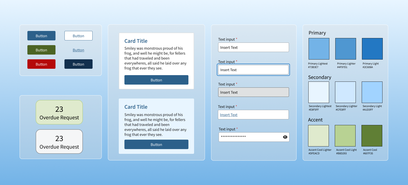
An agency maintained multiple digital platforms built independently over time. UI patterns were inconsistent, components were repeatedly rebuilt, and accessibility standards varied across products. The design system initiative Is to create a shared foundation for designers and developers, improving consistency, scalability, and cross-team alignment.
The challenge, needed to introduce standardization without disrupting active development. Here are some areas to considered.
Multiple teams designing in parallel without shared standards
Core UI components rebuilt repeatedly across applications
Accessibility compliance inconsistently applied
Designers and engineers operating in silos
Live products that could not be fully redesigned from scratch
Component System
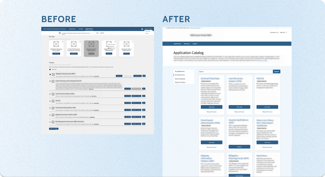
I directed the standardization of high-impact, reusable components across applications, prioritizing patterns that were repeatedly rebuilt or inconsistently implemented.
Core components included:
Buttons and states
Form structures and validation patterns
Navigation systems
Modals and overlays
Data tables and structured content patterns
Each component was fully documented with:
Clear usage guidelines
Accessibility requirements
Defined edge cases
Implementation considerations for engineering
Documentation was completed for every system component, creating a true single source of truth across teams rather than a static pattern library.
Governance & Cross-Team Adoption
Started with USWDS as a baseline, but the agency’s workflows required deeper customization and structural alignment.
I assisted with the development of a cohesive visual and interaction foundation that could scale across products while remaining flexible for application-specific needs.
This included defining:
A unified color system aligned to accessibility standards
A scalable typography hierarchy
A spacing and layout framework to reduce visual inconsistency
Core interaction principles to guide behavior across products
Rather than layering styles on top of existing interfaces, we established a durable system architecture that could support future growth.
Outcome & Takeaways
There were quite a few takeaways from building this design system library.
Collaborating with multiple designers ensuring the team was in agreement. With more people involved, it always brings different view points which can be a positive or negative experience.
Ensuring every component is 508 compliance by having peer reviews and utilizing accessibility tools.
Research and creating new components as new services and functionalities are needed.
This was my first time building a system for such a large portfolio of applications which has improved my skills in the following areas: adaptability, collaboration, client relationship, and details oriented.
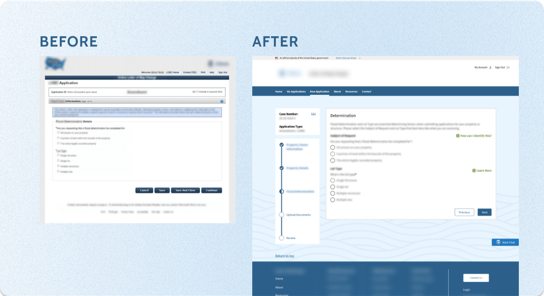
The design system shifted the agency from fragmented product teams to a shared, scalable design foundation.
As a result:
Reduced redundant component builds across multiple product teams
Increased visual and interaction consistency across 6+ major applications
Improved onboarding for new designers through structured documentation and defined standards
Strengthened accessibility alignment by embedding requirements directly into component usage
Enabled faster feature delivery through reusable, production-ready components
Established a sustainable governance model to support long-term system evolution
What began as a standardization effort became an operational shift toward shared ownership, consistency, and scalable design practices across the organization.